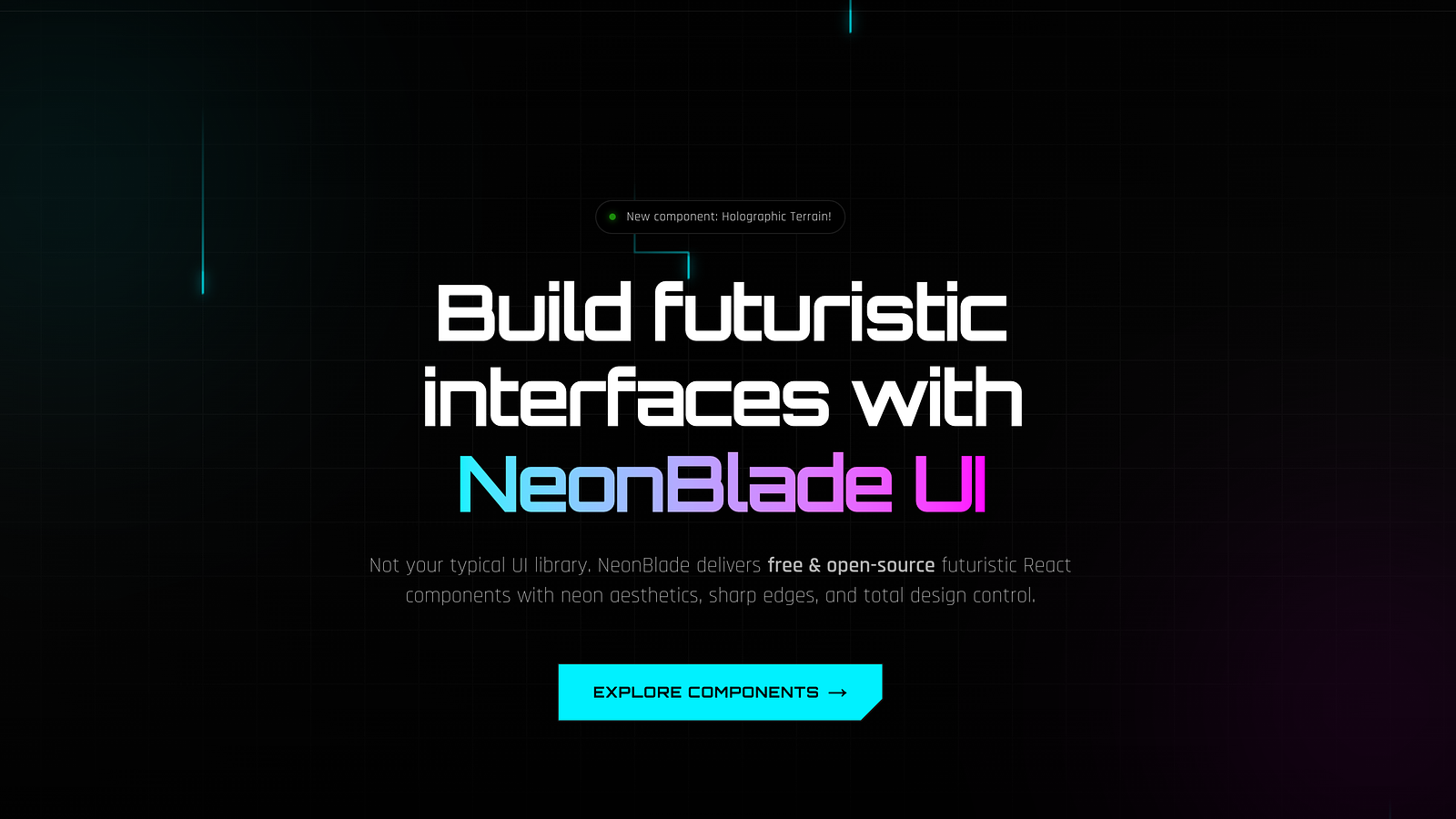

A free and open-source futuristic React component library with sci-fi aesthetics built with Tailwind CSS. No wrappers. Just code that's yours.
The Rule Is Simple
NeonBlade UI has zero lock-in. Components are downloaded directly into your project — they live in your codebase, not inside a node_modules black box. The only real requirement is Tailwind CSS. That's it. Install Tailwind, run the CLI, and you're building.
Have Tailwind CSS set up in your project
Run the CLI to add components
Components drop straight into your source code
Customise however you want — it's your code now
Installing Tailwind CSS
NeonBlade UI is built on top of Tailwind CSS v4 as the primary styling engine. If you don't have it yet, here's how to get set up.
Next.js
npm install tailwindcss @tailwindcss/postcssThen add @import "tailwindcss" to your global CSS file.
Vite (React)
npm install tailwindcss @tailwindcss/viteAdd the Tailwind Vite plugin, then import Tailwind in your CSS entry.
The NeonBlade CLI
NeonBlade UI ships its own CLI. It's built from scratch for NeonBlade and talks directly to our component registry. No config files, no init steps. Run it anywhere in your project.
Add a component
npx neonblade add <component-name>List all available components
npx neonblade addThe CLI will automatically detect your package manager ( npm, pnpm, yarn) and install any required dependencies.
Example Usage
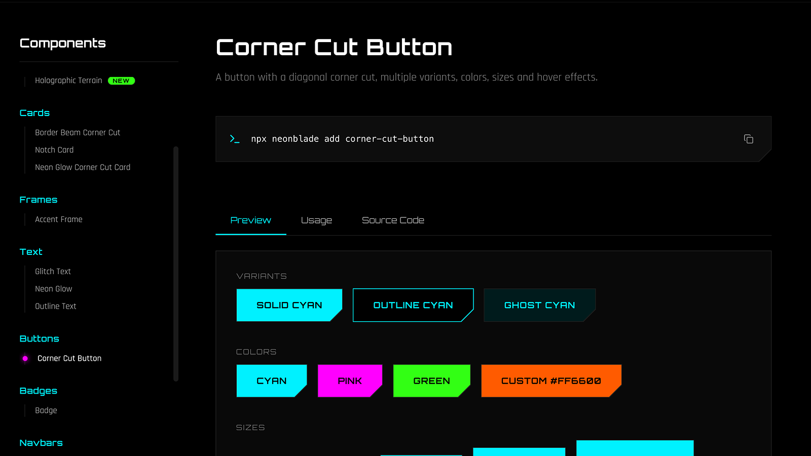
Let's add the corner-cut-button component to your project:
npx neonblade add corner-cut-buttonThe CLI fetches the files, installs dependencies, and places them in your project.
Then use it:
export default function Page() {
  return (
    <CornerCutButton>
      Hello, Future
    </CornerCutButton>
  );
}
Supported Environments
NeonBlade UI components are standard React components — anything that runs React and Tailwind CSS is supported. Here's what we directly test and recommend:
Next.js
React
Vite
TypeScript
Tailwind CSS
Package Managers
npm
pnpm
yarn
NeonBlade UI also plays well with Remix and Astro (with React integration) — anywhere you can import a React component and have Tailwind scanning your files.
Browse Components
All available components — backgrounds, buttons, cards, text effects, frames — are documented in the component library. Live previews, prop tables, and usage code included.